This post is all about the best light paint colors for living room so that you can create a bright and beautiful space.
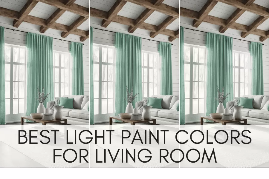
Choosing the right paint color for your living room is a hard decision. You want a color that will feel spacious and bright, while still maintaining your style and ensuring that it can last throughout the years.
Luckily I’ve found the ten most popular paint colors from Benjamin Moore that you can use in your living room design.
This post is all about the best light paint colors for living room.
Best Light Paint Colors for Living Room
Benjamin Moore
As one of the most popular paint brands used by designers, I was able to find a beautiful selection of light paint colors that interior designers swear by when painting a home. Some of the most popular light paint colors that I found include:
1. Pale Oak
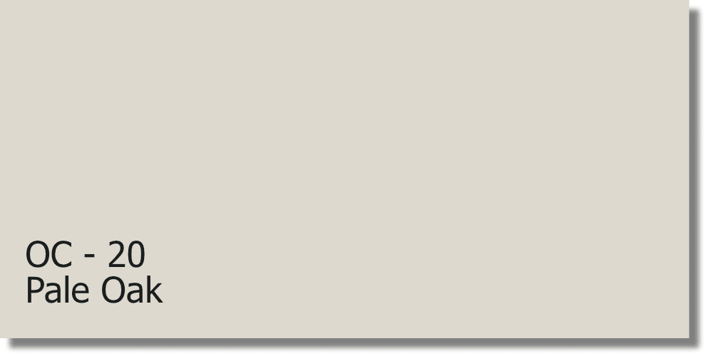
Pale Oak is a light, warm greige (a combination of gray and beige) color. It has a neutral base with a slight hint of warmth, giving it a soft and inviting feel. This neutral color would work well to lighten any room its LVR (light reflective value) is 68.64 making it a light paint color that would brighten any space.
Examples of Pale Oak by Benjamin Moore:
Pale Oak is used on the walls of this photo.
Pale Oak is used on the cabinets in this photo.
2. White Dove
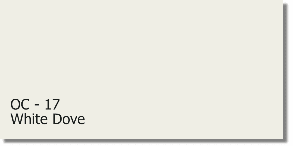
White Dove is a warm white paint color with a slight gray undertone. It belongs to the off-white family, which means it has a touch of creaminess to it, making it softer and warmer compared to pure white hues. This warm white color has an LVR (light reflective value) of 83.16 making it a very bright color that will pull in light, but with the added warm won’t be too bright on the eyes.
Examples of White Dove by Benjamin Moore:
White Dove is used on the walls in this photo.
White Dove is used on the walls in this photo.
3. Swiss Coffee
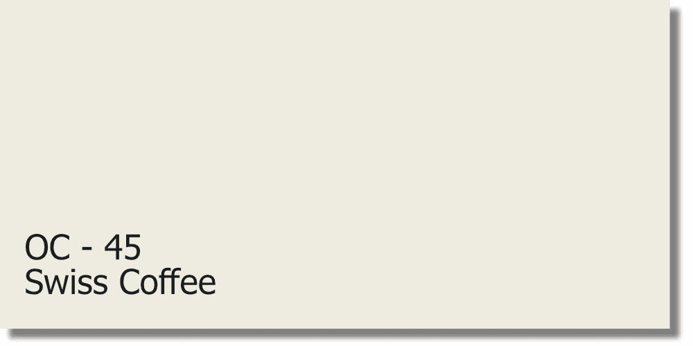
Swiss Coffee belongs to the white color family. However, it is not a pure, stark white but a creamy off-white with a hint of yellow undertones. The yellow undertones in Swiss Coffee give it a warm and cozy appearance. This makes it an excellent choice for creating a welcoming and comforting environment. The yellow-toned white has an LVR (light reflective value) of 81.91 making it a very light color that adds hints of warmth to your room.
Examples of Swiss Coffee by Benjamin Moore:
Swiss Coffee is used on the walls in this photo.
Swiss Coffee is used on the cabinets in this photo.
4. Classic Gray
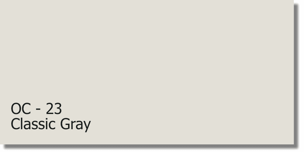
Classic Gray is a warm gray paint color with subtle undertones of beige and greige (a blend of gray and beige). It is a soft, neutral shade that works well with various interior styles and color schemes. It has a slight warmth to it, which helps to create a cozy and inviting atmosphere. The beige and greige undertones provide depth and prevent it from appearing too cool or sterile. This warm gray color has an LVR (light reflective value) of 73.67 making it a slightly darker color than any of the others listed above, but still very light.
Examples of Classic Gray by Benjamin Moore:
Classic Gray is used on the walls in this photo.
Classic Gray is used on the walls in this photo.
5. Chantilly Lace
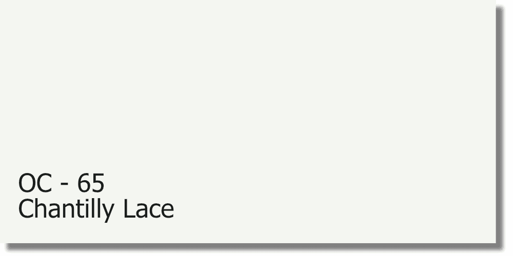
Chantilly Lace is a true white paint color without any noticeable undertones. It is a bright and pure white shade that creates a fresh and airy look in any space. It is highly versatile and works well in both traditional and contemporary settings. Its neutrality allows it to blend seamlessly with various color palettes and decor styles. This bright white color has an LVR (light reflective value) of 90.04 making it the lightest color in this list.
Examples of Chantilly Lace by Benjamin Moore:
Chantilly Lace is used on the cabinet in this photo.
Chantilly Lace is used on the walls in this photo.
6. Collingwood
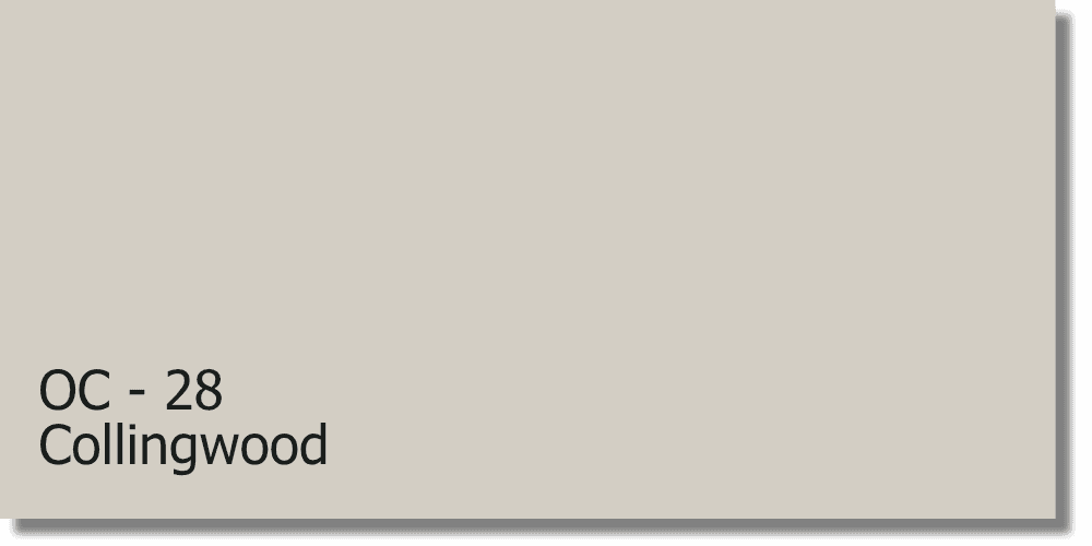
Collingwood is a warm gray paint color with subtle beige undertones. It is often described as a “greige” (a blend of gray and beige) due to its balanced combination of cool and warm tones. Collingwood has a soft and inviting appearance. Its slight warmth helps to create a cozy and welcoming feel. Its beige undertones add depth and prevent it from feeling too cool or stark. Collingwood has an LVR (light reflective value) of 61.52 making it a slightly darker color but still relatively light.
Examples of Collingwood by Benjamin Moore:
Collingwood is used on the wall of this photo.
Collingwood is used on the walls in this photo.
7. Gray Owl
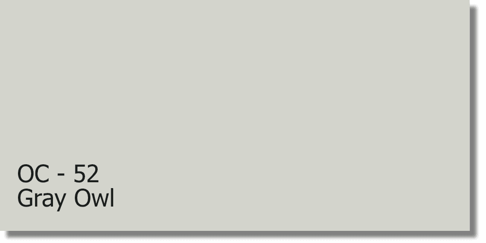
Gray Owl is a subtle light to medium gray paint color with subtle blue and green undertones. It is often described as a cool gray, but it has a softness that prevents it from feeling too cold or sterile. It has a whisper of blue and green undertones, which give it a serene and tranquil appearance. These undertones can become more apparent in certain lighting conditions, creating a subtle hint of color. Gray Owl has an LVR (light reflective value) of 64.51 making it a medium-light color.
Examples of Gray Owl by Benjamin Moore:
Gray Owl is used on the walls of this photo.
Gray Owl is used on the walls in this photo.
8. Calm
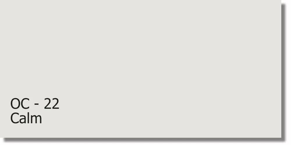
Calm is a light and soft neutral paint color. It is a warm off-white with subtle hints of beige and gray. Calm has a gentle and understated appearance, creating a tranquil and serene atmosphere. A balanced combination of warm and cool undertones, the beige undertone establishes a sense of warmth while the gray undertone adds depth and prevents it from appearing too creamy or yellow. This beautiful neutral has an LVR (light reflective value) of 75.83 making it a very soft, yet warm color.
Examples of Calm by Benjamin Moore:
Calm is used on the walls in this photo.
Calm is used on the walls in this photo.
9. Quiet Moments
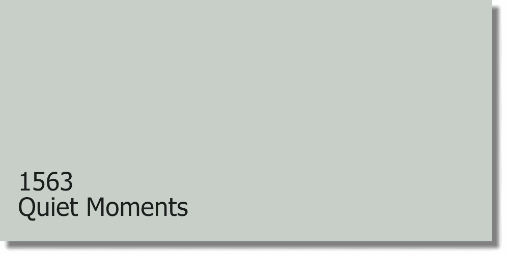
Quiet Moments is a soft and soothing blue-gray paint color. It is a light to medium-toned shade that evokes a sense of tranquility and relaxation. It has a cool undertone with a hint of gray, creating a serene and peaceful atmosphere. The subtle blue undertones in the color give it a cool and refreshing feel. The gray undertones add depth and prevent it from leaning too much towards a pure blue shade. The combination of blue and gray creates a versatile color that can work well in various design styles. The LVR (light reflective value) of Quiet Moments is 60.73 making it a medium-light shade that will reflect a fair amount of light around the room.
Examples of Quiet Moments by Benjamin Moore:
Quiet Moments is used on the walls in this photo.
Quiet Moments is used on the walls in the photo.
10. Balboa Mist
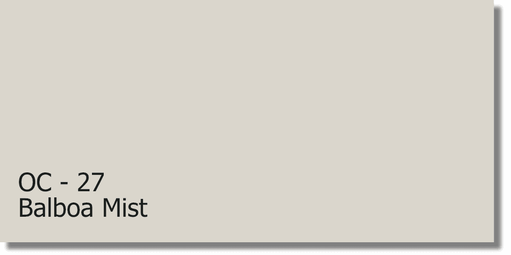
Balboa Mist is a light gray paint color with warm undertones. It has a subtle mix of gray, beige, and taupe, which gives it a warm and inviting feel. It is often described as a “greige” color because it has elements of both gray and beige. This warm neutral has an LVR (light reflective value) of 65.53 making it a medium-light color that would reflect a fair amount of light around the room.
Examples of Balboa Mist by Benjamin Moore:
Balboa Mist is used on the walls in this photo.
Balboa Mist is used on the walls in this photo.
This post was all about the best light paint colors for living room, so that you can design the living room of your dreams.
