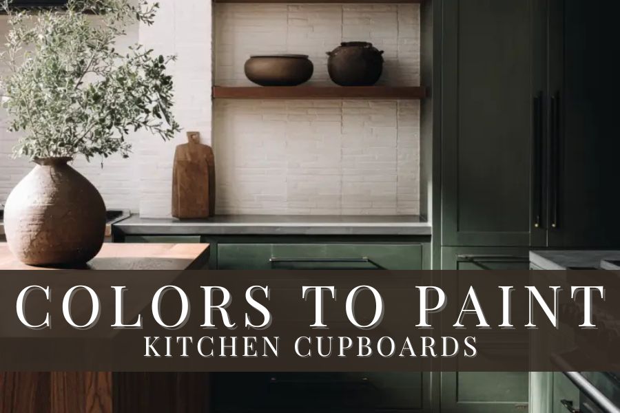
This post is all about the best colors to paint kitchen cupboards.
When it comes to kitchen design, cupboard color is one of the most important decisions you’ll make—it can truly make or break the room. Cabinets take up the most visual space in your kitchen and act as the main focal point, so choosing the right color (or color combination) really matters.
This list will help you figure out which colors and pairings will make your kitchen shine. From classic to bold, these options are guaranteed to look beautiful in your space and spark inspiration for your home.
Colors To Paint Kitchen Cupboards
1. Stone Hearth by Benjamin Moore
Stone Hearth by Benjamin Moore is a stunning kitchen cabinet color. This earthy shade, with hints of both brown and gray, pairs beautifully with the wood-stained island finished in black walnut. It’s a gorgeous mid-toned color with an LRV of 48.45.
2. Pantalon by Farrow & Ball
A deep and dramatic color, Pantalon by Farrow & Ball is the highlight of this kitchen. Sitting between green and brown, it acts like a chameleon—shifting throughout the day depending on the light. Paired with gold hardware, the color truly shines, giving the space a modern yet classic feel. While an LRV isn’t available for Farrow & Ball colors, it’s classified as a dark tone.
3. Morris Room Grey by Sherwin Williams
Part of the Sherwin-Williams Historic color collection, Morris Room Grey is a timeless shade that brings depth and character to kitchen cabinetry. It’s a gorgeous medium-depth color with an LRV of 37. As a versatile neutral, it pairs effortlessly with a wide range of colors and design styles.
4. Slate Tile by Sherwin Williams
Slate Tile by Sherwin-Williams is the perfect neutral to add a hint of color to your space! A beautiful blue-gray, it’s a cool shade that brings a calm, sophisticated feel to any room. A medium-dark color, it sits at an LRV of just 15, meaning it’s best suited for kitchens with ample natural light or well-planned lighting to prevent the space from feeling too dark.
5. Poised Taupe by Sherwin Williams
Taupe is an emerging color trend, and Poised Taupe by Sherwin-Williams may be just the shade your kitchen needs. When paired with natural wood stains and gold hardware, as seen above, it creates a warm, elevated look. A medium-toned color with an LRV of 22, it works beautifully in a variety of lighting conditions.
6. Dried Thyme by Sherwin Williams
Dried Thyme by Sherwin-Williams is a beautiful and versatile shade of green! With a slightly cool undertone, it will make your kitchen feel relaxing and tranquil. A medium shade, its LRV sits at 21—right at the cutoff between medium and medium-dark.
7. Natural Cream by Benjamin Moore
Make your kitchen feel warm and lived-in with Natural Cream by Benjamin Moore! This soft greige is a light shade with an LRV of 64.78, perfect for brightening your space. It pairs beautifully with a crisp white like Chantilly Lace, creating a gentle contrast that keeps the room feeling bright and cozy.
8. Blue Gray by Farrow & Ball
Painted on the lower cabinets above, Blue Gray by Farrow & Ball is a gentle, inviting shade. This stunning, multi-dimensional color softens the look of your kitchen. Blue blends with green and black to create a cool, tranquil shade that feels relaxing and at ease. Farrow & Ball does not release LRV values but classifies this color as a mid-tone shade.
9. Baby Fawn by Benjamin Moore
Similar to Natural Cream, Baby Fawn by Benjamin Moore is a warm, soft greige. Ever so slightly darker, it sits one point lower on the LRV scale at 63.09. This light shade brightens your space while maintaining a cozy feel.
10. Antique Rose by Benjamin Moore
Looking for a unique color for your kitchen cabinets? Try Antique Rose by Benjamin Moore! This dusty rose with brown undertones creates a beautiful, feminine shade that adds character to your kitchen. With an LRV of 33.66, it’s a medium-toned color that works well in a variety of lighting conditions.
11. Treron & Drop Cloth by Farrow & Ball
A stunning color combination, this kitchen features both Treron and Drop Cloth by Farrow & Ball on the cabinetry. Drop Cloth is painted on the upper cabinets, while Treron is used on the kitchen island. A mix of grey and beige Drop Cloth is a stunning neutral mid-tone shade. Treron, on the other hand, is a deep green shade, a beautiful choice for a modern or farmhouse look.
12. Old White by Farrow & Ball
Not technically white, Old White by Farrow & Ball reads as a soft vintage color. A mix of grey and green, the color gives an aged, historic look. Cooler northern light will enhance the green undertones, while warmer southern light highlights the grey.
13. Wordly Gray by Sherwin Williams
A modern, versatile shade, Wordly Grey by Sherwin-Williams is a beautiful option for kitchen cabinetry. A warm neutral that brings a cozy, inviting feel to your kitchen, the color is considered a light shade, sitting at an LRV of 57.
14. Dead Salmon by Farrow & Ball
A rich, muted pink with earthy undertones, Dead Salmon by Farrow & Ball is warm, sophisticated, and full of character. Hints of brown and clay give it a grounded, almost neutral feel, so it never reads too pink. The result is a cozy, lived-in shade that adds depth and warmth while still feeling timeless and elevated.
15. Laurel Woods by Sherwin Williams
A gorgeous dark shade of green, Laurel Woods by Sherwin-Williams is a stunning, dramatic color. Green, cyan, and charcoal blend to create this rich hue. With an LRV of just 6, it’s a deep shade that will make a bold impact in any space.